The redesign at a glance
Part of a long term redesign of Freebird's site, a "horizon project." I led the vision and the work to take the highest leverage page, the product page, from outdated to modern.
Freebird's site redesign was a long term, multi team effort. Rather than boil the ocean, we narrowed focus and tackled the product page first, the page that does the most commercial work. As lead, I owned the product vision and thinking, partnering with a PM, three backend developers, a UX researcher, and stakeholders from Marketing, eCommerce, and Social.
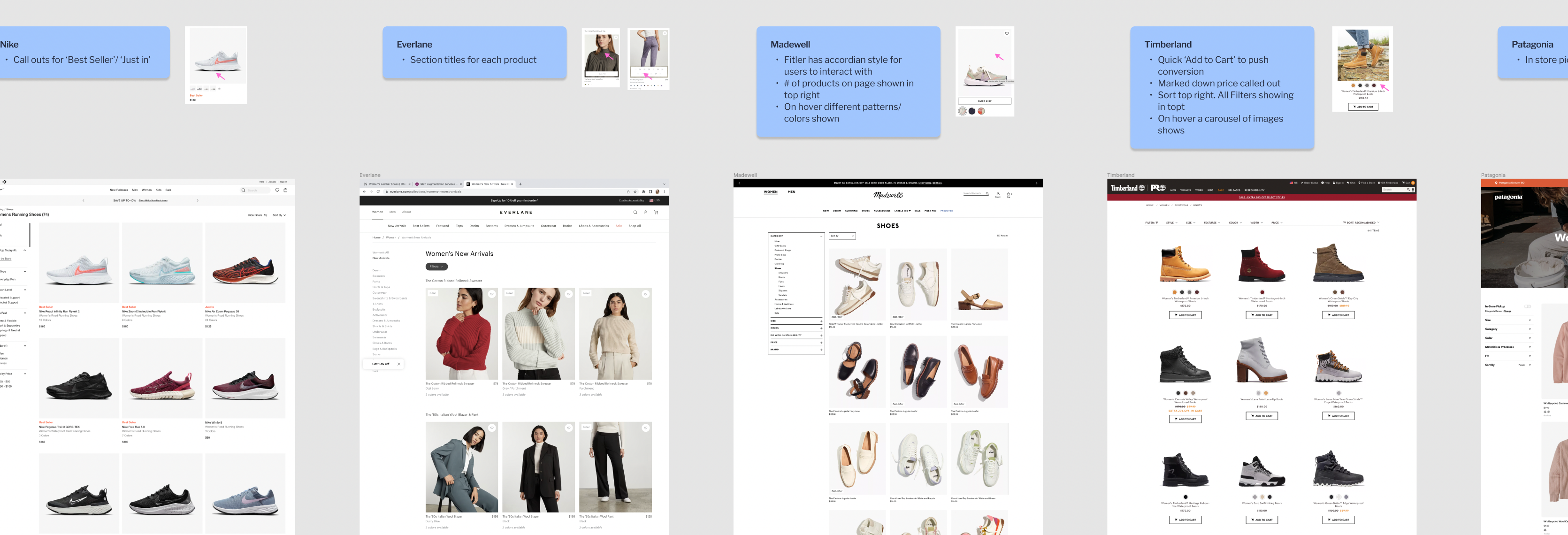
Studied how the best retail product pages convert, building the evidence base to align stakeholders before any pixels moved.
A redesign this visible needed agreement across Marketing, eCommerce, and Social. I made the case so research could turn into design.
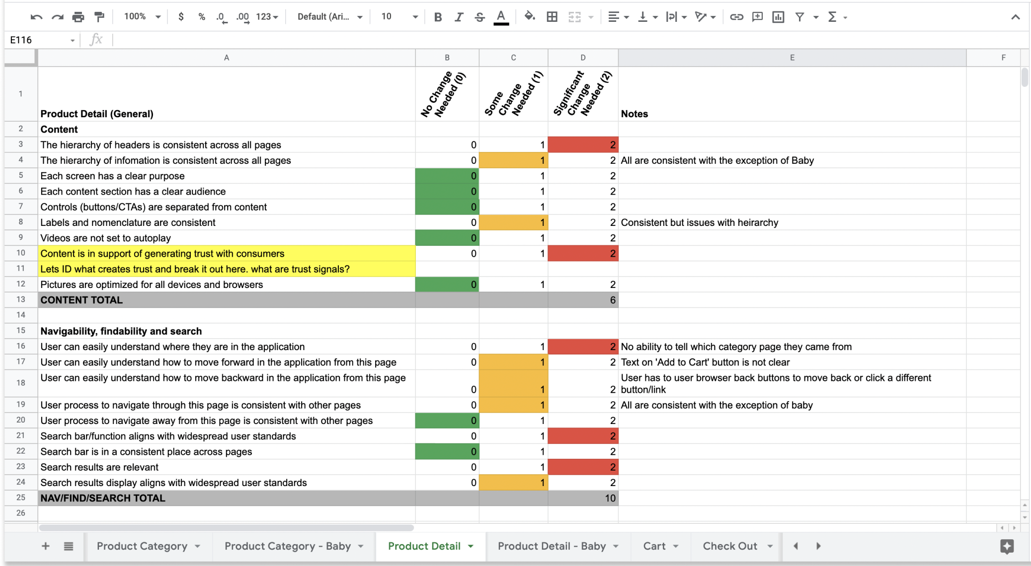
Documented exactly what was outdated and the specific updates the page needed, a clear, prioritized punch list.
Reworked the product page (and related critical pages) against the new direction, aligned to the design system.
The audit made the gaps obvious, and gave us a concrete list of updates to make.
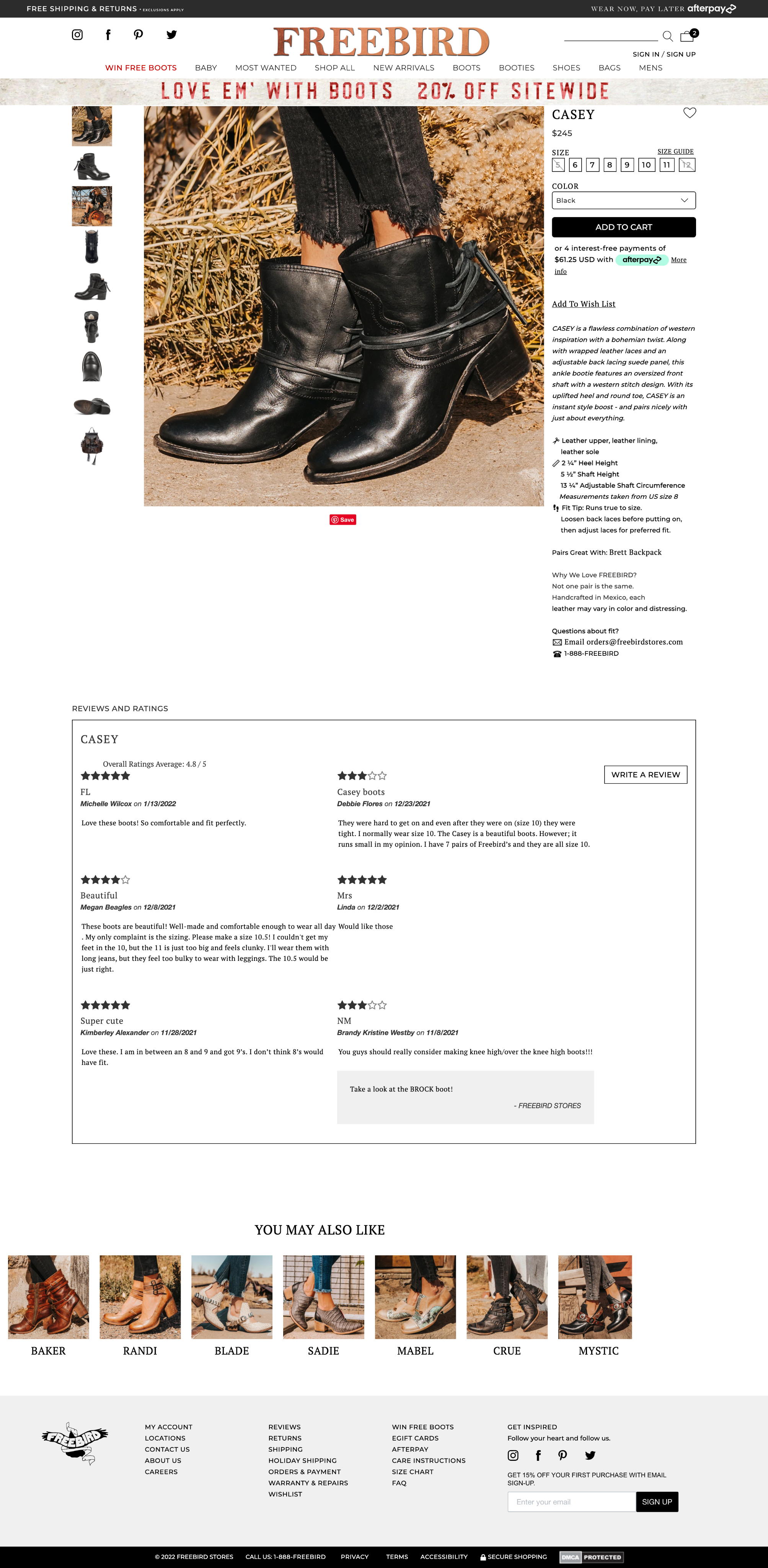
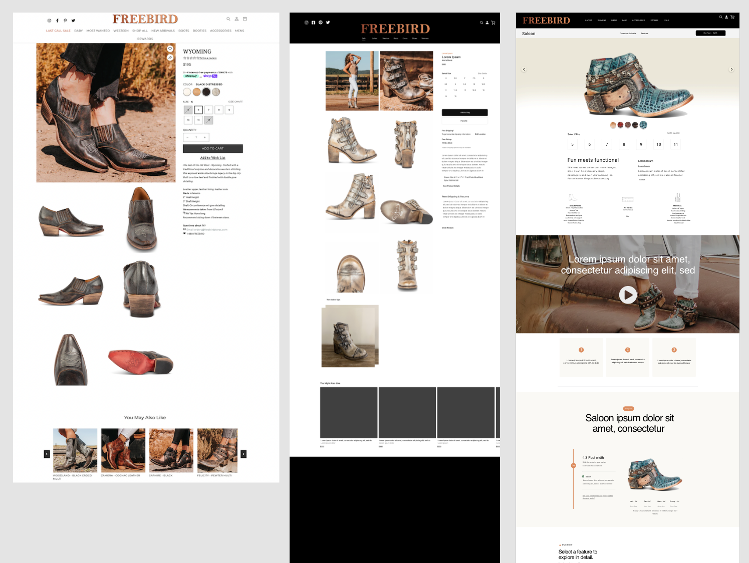
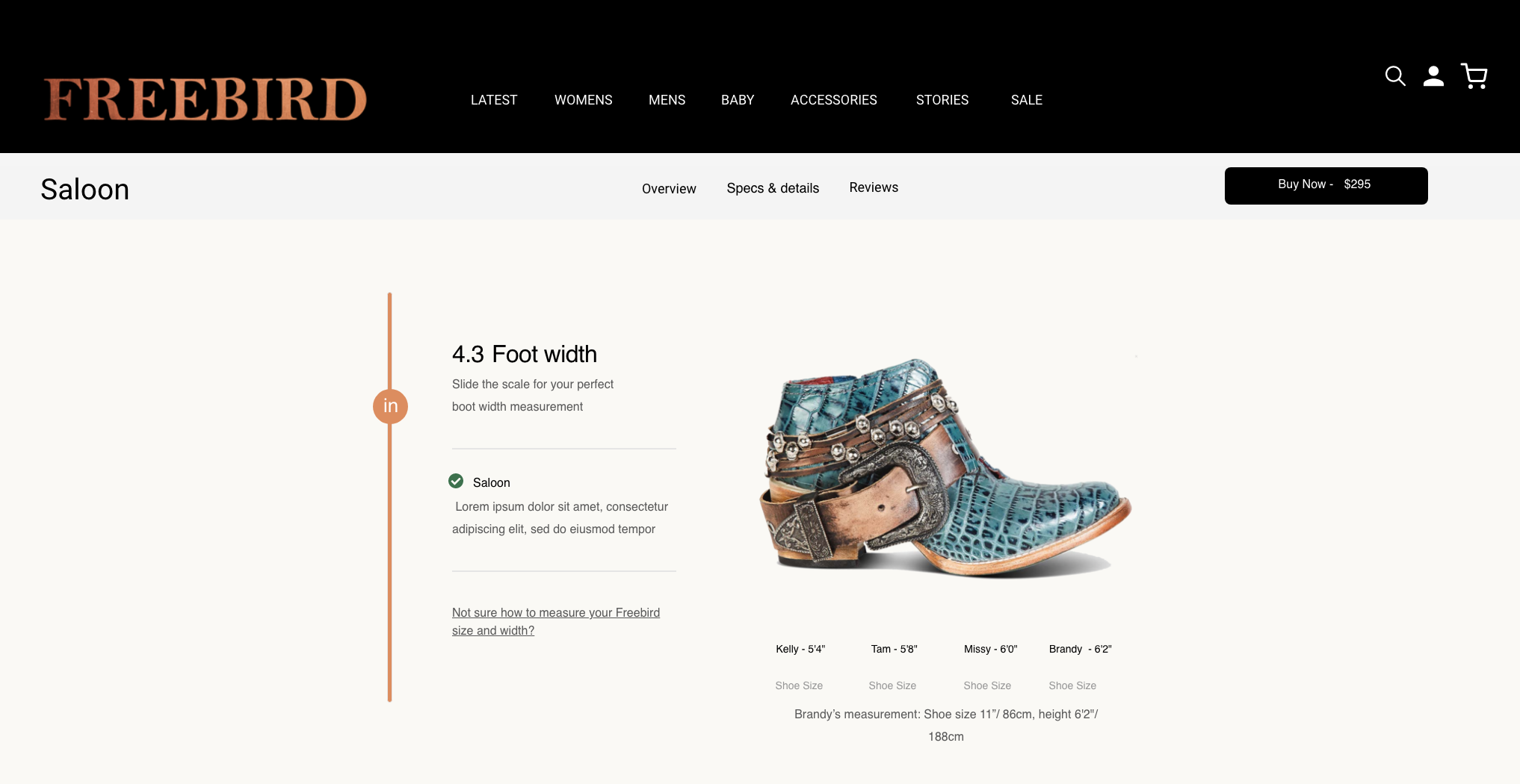
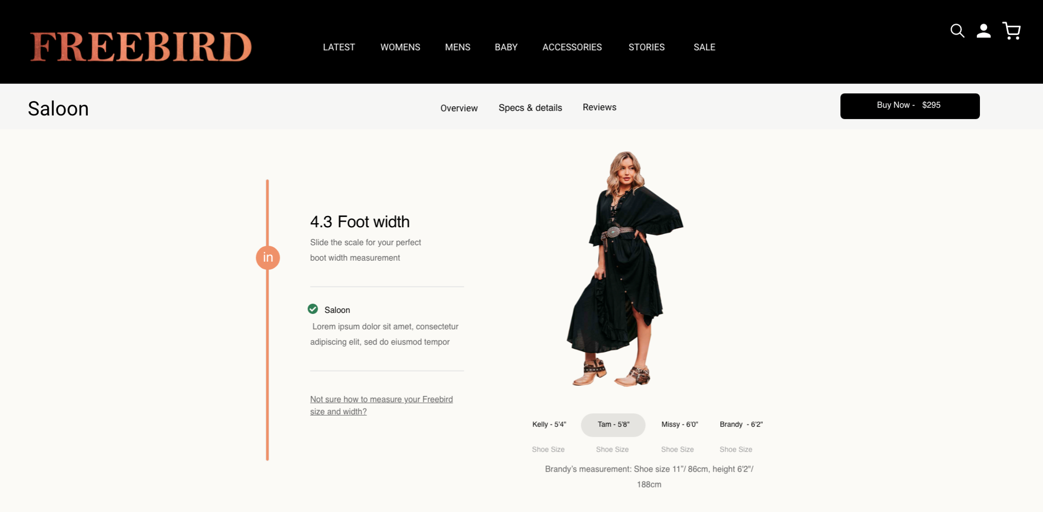
The redesigned product page is cleaner, more confident, and built to convert, with clearer hierarchy, stronger imagery, and a layout aligned to the new design system.
The biggest lever wasn't visual, it was focus. Picking one high impact page and building consensus around it turned a stalled "redesign everything" ambition into shipped progress. Leading the vision also meant doing the unglamorous work, the competitive analysis and the stakeholder conversations that make design possible.